ClearPath
A London mortgage advisory with a private client portal, built so buyers can track their application, share documents, and message their broker in one calm place.
TimeLine
3 weeks
Industry
Financial Services
Scope
Branding, Website and Client Portal
Visit Site ->

Problems
1
Buyers left in the dark
2
Documents chased over email
3
Conversations scattered everywhere
4
Generic, forgettable brand
Solution
1
Live portal with case timeline
2
Drag-and-drop document centre
3
One threaded message centre
4
Calm emerald-and-brass identity


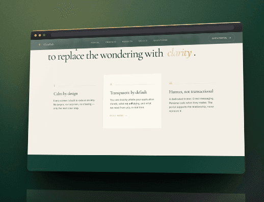
WHAT WE GIVE
Features and Developement

The first thing you see is a brass compass turning slowly in 3D, following your cursor as you move. It is built with Three.js, not a flat image, and it sets the tone in a second. The aim is to make a financial product feel calm and considered before a word of copy hits.
Five working portal screens sit inside the page so visitors can see exactly what they get after they sign up. The timeline, the document centre, the messages, the calendar and the broker view are all in there. Nothing is mocked in Photoshop; every panel is real UI you can study before you commit.

The page reads like a story rather than a brochure. As you scroll, sections slide, stats count up and small details respond to where you are, all driven by GSAP and Lenis. Reading time is short, decisions feel easier, and prospects arrive on the contact form already half sold on the firm.
View MORE
Related Works


Boost productivity
Craft your future ready product now!
Ready to take the next step? Join us now and start transforming your vision into reality with expert support.
